Halo Lumi - Branding Inspired by Light and Space
Designing a brand identity is more than just aesthetics - it’s about capturing the essence of what a brand stands for. With Halo Lumi, a modern lighting store specializing in designer lamps and chandeliers, the visual identity was crafted to reflect the very nature of light and shadow, brightness and warmth, minimalism and depth.
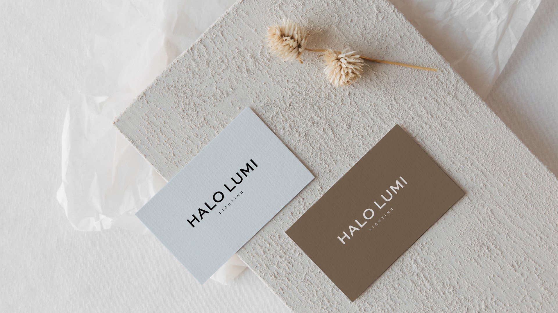
The color palette plays a crucial role in telling this story. Soft, airy blues symbolize clarity, illumination, and the crispness of modern design, while warm, grounding browns evoke shadows, atmosphere, and the cozy ambiance that well-placed lighting creates. Together, these hues form a harmonious balance, much like the interplay of light and space in a thoughtfully designed interior.
The minimalist logo and sans-serif typography reinforce the brand’s focus on clean design and functionality, embodying the sleek, contemporary elegance of Halo Lumi’s product offerings. Every element of this branding was intentionally designed to enhance the feeling of refinement, sophistication, and effortless modernity.
A branding concept inspired by the way light transforms space - subtle yet striking, simple yet impactful.


